A WORLDCLASS WEBSITE FOR A LOCAL COMPANY
Omega Bank Card
Project Details
NEW WEBSITE LAUNCHED
September 2017
PROJECT SCOPE
-Logo update, color scheme, complete branding package.
-New WordPress website build.
THE STORY
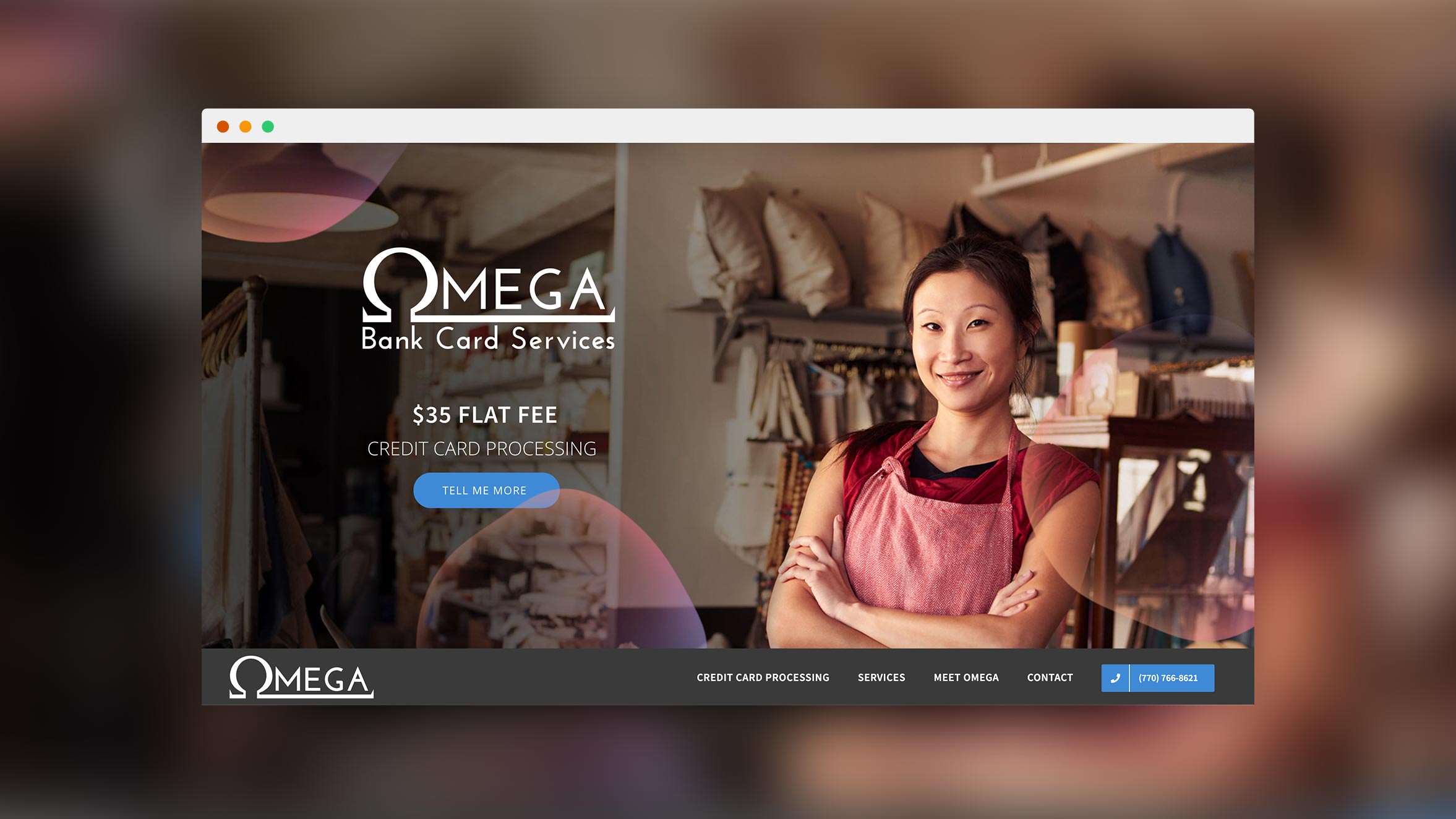
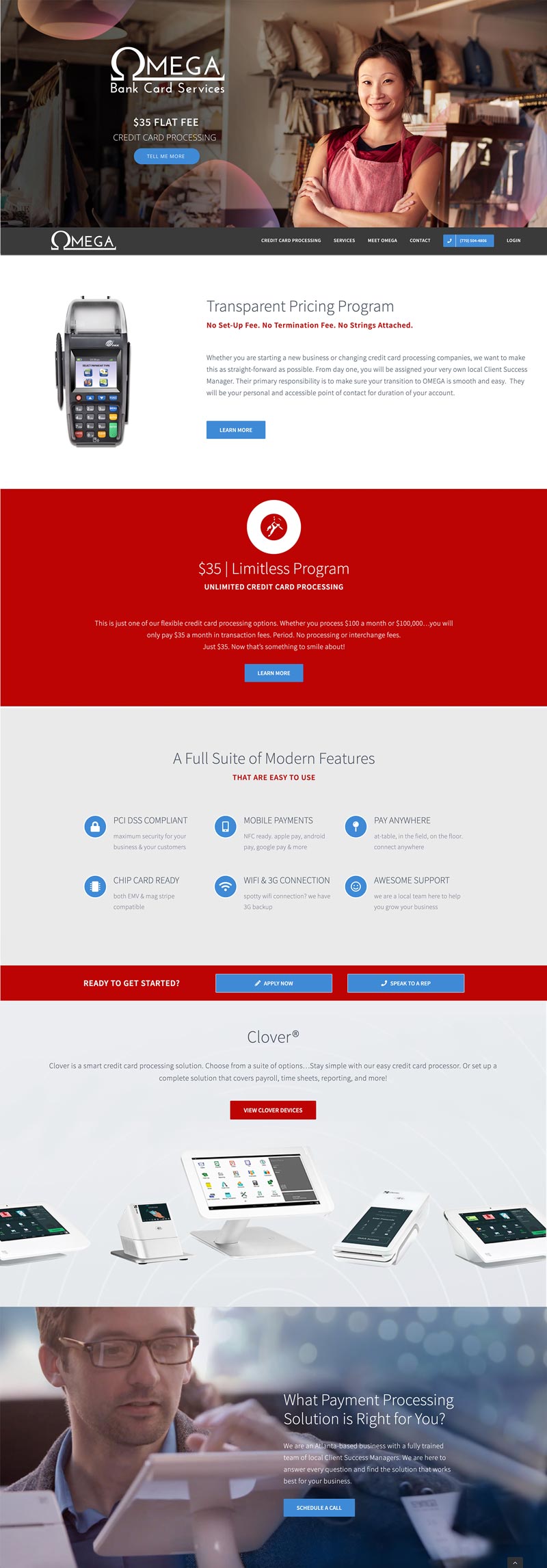
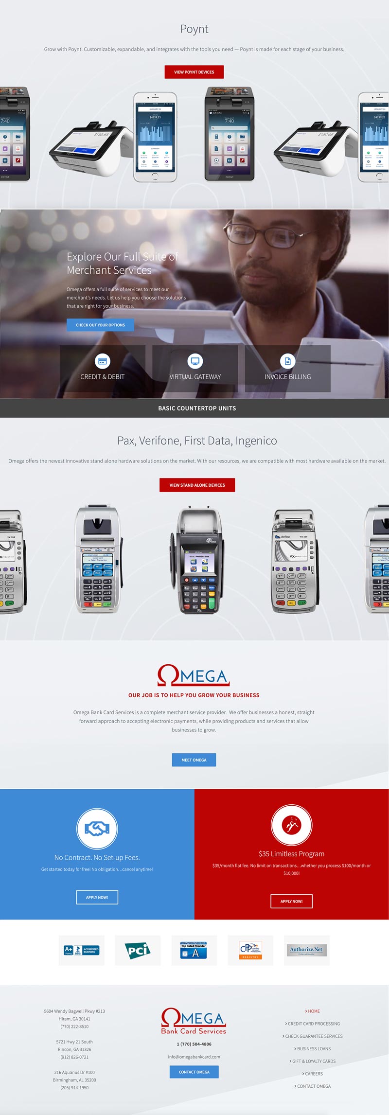
Omega Bank Card needed to shed their small business website. They were a growing business, and their website needed to represent their level of professionalism and commitment to their customers.
The Omega website was designed to elevate their brand, but it still needed to connect to their customers. Most of the Omega credit card processing customers are small businesses. Omega’s owner wanted to portray the “all American” sentiment that is the heart of their business. I chose the red, white, and blue colors to communicate this aspect of their brand.
This is one of my older websites that still feels completely modern and up-to-date. Web design changes quickly, and a good web designer is forward thinking and able to design for the future. Be careful not to hire a designer that will build you a website that already looks old and outdated! It won’t take you very far.


